Wednesday 27 December 2017

The world's favourite colour - blue


Above: Colours used on the top 10 most popular websites


Ioana, A. (2017). Why most people’s favorite color is blue – the peruser – Medium. [online] Available at: https://medium.com/the-peruser/why-most-peoples-favorite-color-is-blue-bd84fc4e4dfb [Accessed 26 Dec. 2017].

As part of a study on gender norms carried out in 2012, University of Maryland sociologist Philip Cohen asked nearly 2,000 men and women what their favourite colour was (Cohen, 2012). Blue turned out to be most popular across the board, followed by green for men and purple for women. ‘Cohen cautioned that he did not survey a random sample of the population, but rather a "convenience sample" of students, faculty and staff at his university, as well as people who heard about the study through social media and link sharing. "However, when I controlled statistically for age, race/ethnicity, education level and student status, the gender pattern was basically unchanged, so that helps increase confidence that the result is not too heavily skewed by who I sampled," Cohen told.’ (Wolchover, 2011). 
'Of course, blue gets used a lot on the internet because we’re not biased towards understanding something particular out of it (like how red shows errors or yellow important bits). Essentially, blue is the color of clear communication, and this is due in no small part to how almost everybody can recognise it — as even color blind people can see it well enough without much effort. What’s more, blue shows up as being one of the best selling color shades for interior design and architecture, and has become a color associated with political liberalism, Christianity and even modern corporate culture — all things that have spread worldwide in recent history, and have gone into warp-drive with the advent of the internet.'

Saturday 23 December 2017

Emotional Reactions to Colour


Interior designers have long used colour to create feelings of coziness or spaciousness. Thought it varies from person to person and people respond differently to different colour stimuli. Blue is the top choice/favourite colour for 35% of Americans, followed by green (16%), purple (10%) and red (9%). 

"A preference for blue and green may be due to a preference for certain habitats that were beneficial in the ancestral environment as explained in the evolutionary aesthetics article."

There is evidence that color preference may depend on ambient temperature. People who are cold prefer warm colours like red and yellow while people who are hot prefer cool colours like blue and green. Some research has concluded that women and men respectively prefer "warm" and "cool" colours.

A few studies have shown that cultural background has a strong influence on color preference. These studies have shown that people from the same region regardless of race will have the same color preferences. Also, one region may have different preferences than another region (i.e., a different country or a different area of the same country), regardless of race.

Conclusion 

If a colour is to be used, blue should be the one. It is the most common favourite colour, is often regarded as being cool and calming, and studies have shown that people with blue bedrooms get the most sleep. 

It is worth noting that emitted blue light has been found to suppresses the release of the sleep hormone melatonin. Blue light filters are now being integrated into device operating systems to help. Whilst important, every display always emits blue light, so the inclusion of additional blue in any of my potential designs wouldn't exacerbate this. 

Monday 23 October 2017

Initial research

Traditional Colour Theory 
Leonardo da Vinci's Theory of Colour etc.
Traditional colour theory in art and design

Neuroscience + Psychology
How the human brain perceives colour (and how other animals see the world?) and how it has evolved over time/why it has evolved. 

Colour in Culture and Society 
How different cultures perceive colour, and the positive and negative connotations of different colours. Difference between biological universalities and cultural nuances.  

And how it all has an impact on design for interfaces
Visual hierarchy, usability, identity conformation, material skeuomorphism 

Wednesday 18 October 2017

COP3 Question Justification

'What role can colour play in user experience design?' is a question that allows me to explore a highly practical design subject matter whilst also taking into account broader theories of biology, sociology and neuroscience i.e. anthropological reasoning behind our inherent like or dislike of colours and how that varies between cultures. It will be incredibly helpful to learn of the ways colour is and can be used in user interface design to shape usability, delight, and identity. A distinction is made between 'is' and 'can' because it's likely that colour is being under-utilised in all but the strongest UI design.

The question represents user experience design rather than user interface design because although the holder of colour would be the interface itself, it is the experience of the user which is at concern. The lines between the two disciplines are often blurred. 

Thursday 12 October 2017

Initial COP idea

An exploration into ethics in graphic design didn't properly apply to my interests. My main personal interests are in future transport, space exploration, renewable energy and creating a more exciting future. 

Potential questions could be 'What role does design play in creating a more exciting future?' or a more focused 'What role does experience design play in creating a more exciting future?'


A selection of slides from my initial COP presentation 


Though the question of a more exciting, design-led future allows for an in-depth analysis of modern and ancient philosophy and biology/neuroscience, it is too broad a question to be worth fitting into 5000 words. It would also be of greater personal benefit to me if the question was focused inherently on an aspect of user interface design. 

Wednesday 19 April 2017

Thursday 16 March 2017

Market testing with an archetypal user


Because of my relatively limited access to the target market, mass surveys were not an appropriate method of gathering research data. Instead, intensive market testing was conducted with an archetypal user who has extensive appearance with a large variety of vehicle infotainment systems. 


(Alex Alexiev)


Additionally, technical research was conducted with a designer at McLaren Automotive (it is worth nothing that although McLaren targets a different audience than that of Land Rover, they are one of the most exciting and engaging car manufacturers), who offered general advice on automotive HMI.  


Monday 13 March 2017

Design Development and Evolution


The philosophy behind the practical piece - extracted from essay


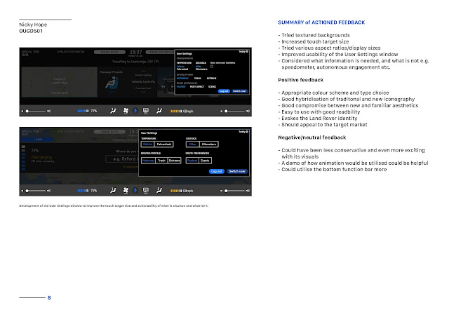
Like the version of InControl Touch Pro for purely manual Jaguar/Land Rover vehicles, this concept for a future autonomous version of the Land Rover Discovery also utilises colour to allow the user to associate them with certain functions of the system, allowing for faster location. 


Unlike the current versions of the system, however, the autonomy of the vehicle allows for shifted priorities and more liberties to be taken with the visuals. 


Though a familiar aspect ratio was employed, more unique and engaging aspect ratios were explored: 


Though early versions of this system show a notification when the car is driving autonomously, this was deemed unnecessary in feedback groups. Cited reasons include its presence being in other areas (i.e. a more prominent heads-up-display) or the assumption that the car would always be driving autonomously unless the driver engaged the steering wheel.  


And then again, a more traditional aspect ratio: 


Though ultra-wide screens provide a highly exciting and engaging experience through their unique appearance, they are less well suited for functions like watching films and videos, which is an activity many people would do in the environment of an autonomous vehicle. 


The more traditional aspect ratio seen here (mocked up on a prototype Tesla Model 3 interior) would be more effective at displaying most content - particularly videos.