Context of Practice
Sunday, 21 January 2018
COP3 Synergy
This research project has aimed to discover the impact that colour has on user interfaces, its subsequent effect on user experience design, and the extent to which any found effects are valid.
The written essay element of the project focused on the physio- and psychological effects of colour, including its potential effects on emotions, moods and physical conditions e.g. blood pressure, adrenaline release etc., as well as the degree to which these effects are ingrained (a product of evolution) or learned (a product of culture), including the theory of evolutionary aesthetics, and the cultural differences in the perception of individual colours; as well as the way corporations employ colour to create particular personalities or reinforce product identities.
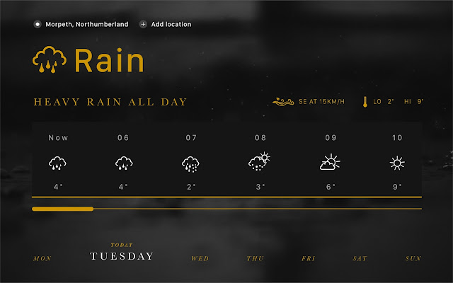
A desktop application was designed in lieu of a mobile-situated environment to ensure my personal skills are developed equally in all device scales. A weather site/desktop app was chosen as the practical piece because of the inherent emotional link that people have to the weather - if the sky is grey, or if it is raining, people's moods tend to be intrinsically worse than if the sky is bright and the sun is shining. In order to assess the emotional impact that colour can have on UI design, the interface was designed in three different colourways which all informed the user that it would be raining all day. One colourway was designed with a number of different greys and dark whites to try and exacerbate the negative impact of rain on people's moods, a blue variant was designed to try and make people feel more relaxed and calmed by the rain (akin to a mindfulness app), and an experimental gold variant was also created to explore if particular product identities; specifically that of luxurious, precious products, could be emulated just through the use of a colour.
In user testing, 95% of users agreed that the blue variant had a ‘calming’ appearance, 76% agreed that the gold version had a ‘luxurious’ appearance, and 72% agreed that the grey version had a ‘melancholy’ appearance.
Though the methods of gathering data were imperfect (e.g. lack of variation in age and cultural representation), the overwhelmingly consistent data gathered offers a clear and present corroboration of the hypotheses.
Beyond this, a set of interesting outliers regarding the grey concept offered an intriguing insight into the different ways in which individuals perceive different colours. Though going against the hypotheses, it served to reinforce the profound and occasionally varying impact colour can have.
Colour has a highly significant role to play in user interface design, and can have a profound impact on how users feel when they interact with a product or service, as well as helping to create visual cues and hierarchy in order to help guide the users through said product, service or system.
Practical Response - Mockups
Practical Response - User Feedback and Psychological Response
One of my primary methods of psychological data collection was conducted on Instagram due to the ease of user response and the large range of ages and professions available to respond. Though there was a disparity in the quantity of responses between the different designs, an overwhelming majority of responses corroborated the hypothesis of each coloured design.
Of the 43 testers questioned, 41 (95%) agreed that the blue variant had a ‘calming’ appearance. Of the 25 testers questioned, 19 agreed (76%) that the gold version had a ‘luxurious’ appearance. Of the 36 testers questioned, 26 (72%) agreed that the grey version had a ‘melancholy’ appearance.
Interestingly, some users agreed with each other on separate, isolated test sessions that they actually found the grey design more calming than the blue; that it made them at peace with the idea that rain was imminent, whereas the blue design gave a negative spin. This is an interesting contrast with the hypothesis; though, in obvious contrast to the tendency of blue to be relaxing, ‘feeling blue’ is an expression used to denote a negative mood.
Practical Response - A reminder of the point of this concept
The point of this practical piece, and the whole project in extension, is to explore and prove what impact colour has on user interface design, and the subsequent impact this has on the experience of users.
A weather app is an effective medium to explore this because of the emotional connection humans have to different forms of weather. If colour can be utilised to mitigate the negativity people feel when they learn rain is imminent, or reinforce the positivity of a sunny day for example, then this is a great leap forward in the emotional aspect of user experience design.
Practical Response - Final Designs and Additional Colours
The point of this project, and the designs themselves, is to explore and attempt to prove the impact that colour has on user interface design, and how people's emotional and physical response to colour has an impact on how users perceive the things they're interacting with.
Gold
Intended to mimic the emotional response to high-class, luxury goods
Grey
Intended to create a sombre, melancholy emotional response
Blue
Intended to create a calming and relaxing emotional response
Practical Response - The importance of iconography
| A simple, easily interpretable set of icons is an undeniable asset for any user interface |
 |
| Iconography helps to enhance the visual appearance, and helps users to interpret information more quickly - particularly for at-a-glance info like small weather widgets for upcoming days. |
 |
| The use of icons can also help reinforce otherwise text-based user interactions; it helps the users realise that it's something they can use or touch |
Subscribe to:
Comments (Atom)


