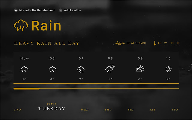
The point of this project, and the designs themselves, is to explore and attempt to prove the impact that colour has on user interface design, and how people's emotional and physical response to colour has an impact on how users perceive the things they're interacting with.
Gold
Intended to mimic the emotional response to high-class, luxury goods
Grey
Intended to create a sombre, melancholy emotional response
Blue
Intended to create a calming and relaxing emotional response


No comments:
Post a Comment